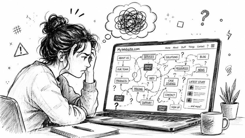
You open a website looking for one simple thing. A pricing page. A class schedule. A refund policy. A recipe. Instead of finding it, you start clicking labels that sound similar, backing up, opening the search bar, then wondering if the information exists at all.
That feeling isn't just bad design. It's usually a sign of weak information architecture.
If you've ever asked, what is Information Architecture, the simplest answer is this: it's the way information is organized so people can find it and understand it. It's the blueprint behind a website, app, knowledge base, course portal, or even a folder full of documents.
For small businesses, student projects, team wikis, and family resources, IA matters more than people think. You don't need a huge ecommerce site to feel the pain of messy structure. A five-page website can confuse people. A shared Google Drive can become impossible to use. A Notion workspace can turn into a maze.
Why Good Organization Is Not an Accident
A website can be small and still feel confusing.
A local bakery may have only a few pages, but if cake orders are hidden under “About,” customers hesitate or leave. A student team may store everything in one shared drive, but if file names are vague, people open three wrong documents before finding the final draft. A chatbot may answer questions about your business, but if your content is scattered and inconsistent, the answer it gives can be incomplete or wrong.
That pattern is not random. It comes from structure.
A library works because someone decided which books belong together, what each sign should say, and how people can look things up when they are unsure. Digital spaces need that same level of planning. A useful website, wiki, course portal, or folder system feels easy because someone made careful choices about where information belongs and how a person is likely to look for it.
The hidden blueprint behind usability
Information architecture works like a building blueprint. Before paint colors, decorations, or furniture, there is a plan for entrances, hallways, and room placement. Content needs the same kind of plan before visual design makes everything look polished.
That is why messy experiences often start with structure, not appearance. If a team keeps HR policies in random folders, new hires ask the same questions repeatedly. If a nonprofit tucks volunteer forms inside a blog archive, signups drop because people cannot locate the next step. If a personal knowledge base grows without categories, even the person who created it starts losing track.
Those are IA problems.
The term became more formal in the early web era through Information Architecture for the World Wide Web by Louis Rosenfeld and Peter Morville, a book often treated as a foundation for the field. Its influence still shows up in how people describe IA today: as the practice of organizing, naming, and structuring information so it can be found and understood.
Good IA helps people feel oriented. Bad IA makes people feel lost, even when the content they need is technically there.
That idea now reaches beyond websites. Search tools, site search, AI assistants, and chat interfaces all depend on clear structure. If your pages, documents, or help content are loosely organized, newer AI tools have a harder time identifying what your business offers, which page answers a question, or which details belong together. That is one reason concepts related to retrieval matter alongside IA. Contesimal's guide to IR systems gives useful background on how systems find and return information.
Why this matters for ordinary projects
Many articles explain IA through the lens of large corporate sites. Small organizations and personal projects need it too, often with less time and fewer people to clean up mistakes later.
For a small business, weak IA can blur the difference between services, pricing, FAQs, and contact options. For a school project, it can turn a simple folder into a scavenger hunt. For a team wiki, it can bury policies under labels that only the original creator understands. For a family resource hub, it can hide forms, schedules, and medical information when someone needs them quickly.
People asking what information architecture is are often asking a practical question: why do visitors, coworkers, or classmates get stuck in a system that makes sense to me?
IA answers that question by shifting the focus from what the creator knows to what the user expects to find. That shift takes intention. Good organization rarely appears by accident.
The Building Blocks of Good IA
A small business website can have every page it needs and still feel hard to use. A visitor clicks "Services," then "Learn More," then "Resources," and still cannot tell where pricing lives or how to contact a real person. That is usually not a content problem. It is a structure problem.
IA works like a building blueprint. The pages are the rooms, but the blueprint decides where each room goes, what each door is called, how people move through the space, and where they ask for help if they get lost.
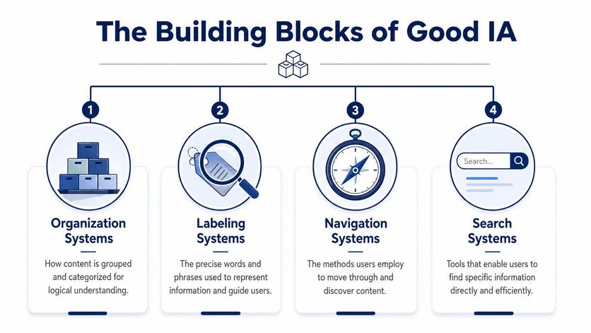
Four parts shape that blueprint: organization, labeling, navigation, and search. These ideas are often explained with large ecommerce sites, but they matter just as much for a two-person agency, a school project, a nonprofit resource hub, or a personal knowledge base. They also matter more as AI tools pull answers from websites, docs, and help centers. If your structure is muddy, both people and machines have a harder time finding the right thing.
Organization gives content a home
Organization is the underlying grouping of your information. It answers a basic question. What belongs together?
A bakery website might group content into Custom Cakes, Daily Menu, Ordering, Locations, and FAQ. A consultant might group by Services, Industries, Case Studies, and Contact. A student project might group research into Sources, Methods, Findings, and References.
Good grouping reduces hesitation. People should not have to guess whether pricing is hidden under Services, About, or Get Started.
Labels tell people what they are looking at
Labels are the names you put on categories, menus, buttons, and links. They are the signs on the doors.
Many small teams frequently encounter this challenge. Internal language creeps in. A founder writes "Solutions" because that is how the team talks. A visitor wants "Bookkeeping Services" or "Plans and Pricing." The label may sound polished internally, but it creates extra interpretation work for everyone else.
A useful test is simple. If a first-time visitor sees a menu label and asks, "What will I find there?" the wording probably needs to be clearer.
Navigation helps people move through the structure
Navigation is the set of paths people use to get from one place to another. Main menus matter, but so do sidebars, breadcrumbs, footer links, related links, and calls to action inside pages.
A law firm site is a good example. Someone may land on a page about family law, then want attorney profiles, common questions, office location, or a consultation form. Good navigation offers those paths clearly. It does not force the visitor to backtrack and start over.
For smaller teams building content quickly, this is often where clutter appears. New pages get added, but the paths between them are never cleaned up. Browsing starts to feel random.
Search helps when people know what they want
Search supports users who arrive with a goal already in mind. They do not want to browse three layers of menus. They want "refund policy," "fall schedule," or "ADA parking."
For a help center, a document library, a product catalog, or a team wiki, search is part of the structure, not an extra feature. That matters even more in AI-driven search and chat interfaces, where systems try to retrieve the best answer from your content. If you want a practical view of that retrieval side, Contesimal's guide to IR systems is a useful companion.
You can see related examples of content structure and user-facing flows on the 1chat blog about AI search and customer experience.
How the four parts work together
These four parts support each other. Weakness in one area puts pressure on the others.
| IA part | Physical analogy | Digital example |
| Organization | Rooms placed in the right areas of a building | Services grouped by audience or task |
| Labeling | Signs on each door | “Pricing” instead of “Solutions” |
| Navigation | Hallways, stairs, and maps | Main menu, breadcrumbs, related links |
| Search | Information desk | Search bar that returns the right page |
A site can have good labels but poor grouping. It can have decent organization but confusing paths. It can have search, yet still frustrate users if pages are named vaguely or buried in the wrong place.
Good IA feels quiet. People find what they need, understand where they are, and move forward without stopping to decode your system. That is true for a company website, a small team wiki, or a personal project. It is also what makes your content easier for AI tools to interpret and surface accurately.
How to Uncover User Logic with IA Methods
Building structure by instinct is common. Individuals often place pages where they would expect to find them. That's understandable, but it's risky. Your mental model isn't always the user's mental model.
Good IA relies on methods that reveal how other people think.
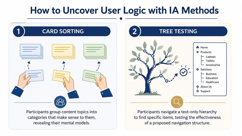
Card sorting finds natural groupings
In a card sort, you give people a list of content items and ask them to group them in ways that make sense to them. This can be physical index cards, sticky notes, or a simple spreadsheet.
Suppose you're reorganizing a music teacher's website. Your cards might include:
- Piano lessons
- Recitals
- Tuition
- Teacher bio
- Beginner FAQ
- Online lessons
- Contact form
One person may group “Tuition,” “Online lessons,” and “Beginner FAQ” under something like “Getting Started.” Another may place “Recitals” with “Student Life” or “Events.”
That tells you something important. Users often see relationships you didn't plan for.
Expert guidance emphasizes using card sorting to discover how users naturally group content and tree testing to validate whether a proposed hierarchy supports item retrieval before implementation, which is why IA is an evidence-driven discipline rather than a purely visual one, as summarized in this overview of information architecture methods.
Tree testing checks whether the structure works
A card sort helps you discover possible categories. A tree test checks whether people can find things in your proposed structure.
In a tree test, you show users a text-only hierarchy, not the full visual website. Then you ask questions like:
- Where would you go to find class pricing?
- Where would you look for warranty details?
- Where would you expect scholarship information to be?
This is powerful because it isolates structure from design. If users fail the task, you know the issue isn't color, layout, or button placement. It's the architecture.
Tree testing answers a blunt question: if the menu were stripped down to words alone, would people still know where to go?
A side-by-side view
| Method | Best for | Example question |
| Card sorting | Discovering how users group content | “Which items belong together?” |
| Tree testing | Validating a proposed structure | “Can you find this item in the hierarchy?” |
You don't need a full UX lab
Small teams can do lightweight versions of both methods.
Ask a few customers, classmates, coworkers, or parents to sort content topics into groups. Then write out your proposed menu and see whether they can find key items without hints. Even informal testing can expose major blind spots.
If your website feels confusing because the paths themselves are messy, Bruce and Eddy's guide to fixing broken websites through user journey mapping can help you see where structure and user flow break apart. For more practical articles on digital usability and AI workflows, the 1chat blog also has useful reading.
IA in the Real World for Small Teams
Information architecture sounds abstract until you see it in ordinary work.
A small accounting firm might serve both individuals and business owners. If the homepage sends everyone into one generic “Services” section, visitors have to sort things out themselves. A clearer IA might split paths early: For Individuals and For Businesses. That one structural choice reduces confusion before anyone reads a paragraph.
Three everyday examples
A family recipe blog offers another good example. Someone looking for dinner ideas may browse by cuisine. Someone else may need gluten-free recipes. Another person may only care about quick meals. Good IA lets the same content be found through more than one path, instead of forcing every visitor into a single menu logic.
A team knowledge base works the same way. New hires don't think like long-time employees. They may not know whether vacation policy belongs under HR, Operations, Team Resources, or Company Handbook. If the labels and grouping reflect internal language only, the system becomes hard to use even if every document exists.
Personal projects count too. A student organizing research notes, source PDFs, interview transcripts, and draft versions is doing IA. So is a parent creating a shared folder for school forms, medical records, and activity schedules.
IA matters even more with AI-driven discovery
The topic now gets more modern.
Recent guidance from Figma and IxDF still frames IA around helping users browse, search, and understand content, but it also stresses search systems, contextual relevance, and user pathways rather than fixed page trees alone, especially as people may arrive through AI answers instead of menus, as discussed in Figma's information architecture resource.
That matters for small teams because people don't always enter through your homepage anymore. They may land on a PDF, a help article, a shared note, or an answer generated from your content.
If your documents have inconsistent names, unclear headings, and weak structure, both people and AI tools have a harder time using them well.
A folder of well-named PDFs with consistent categories, plain-language headings, and clean section titles is easier to search, easier to maintain, and easier for AI-assisted workflows to work with. In practice, that means IA isn't just about websites. It's about making information usable wherever it lives.
A Simple IA Audit for Your Website or Project
You don't need a redesign budget to improve your structure. A short audit can reveal a lot.
A technically strong IA process is iterative and user-centered. It often starts with a content inventory and stakeholder review, then moves through user grouping, hierarchy drafting, and validation before finalizing the sitemap, as described in Step Two's guide to information architecture.
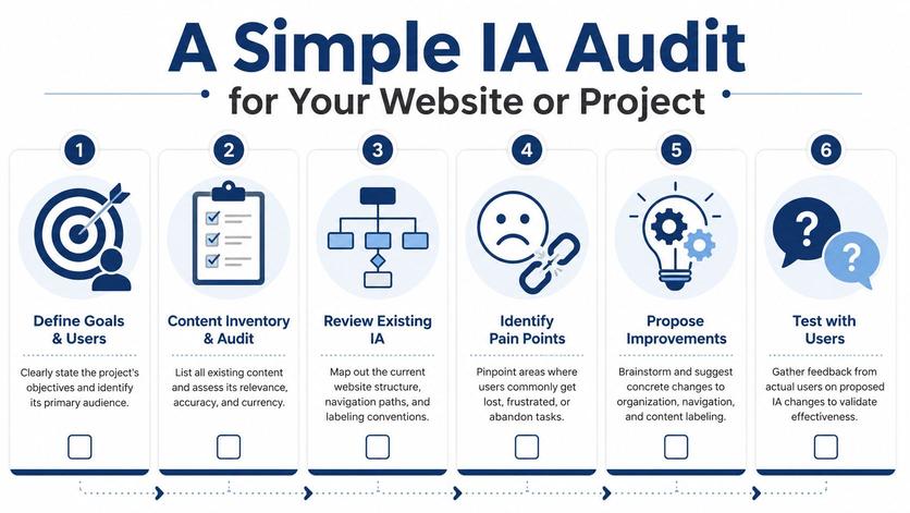
Start with a content inventory
Write down what you have.
That means pages, folders, PDFs, articles, forms, videos, and templates. Many individuals skip this and work from memory. Memory is unreliable. Once everything is visible, gaps and duplicates stand out fast.
Ask simple questions:
- What content exists?
- What content is outdated?
- What content overlaps?
- What content is hard to classify?
If you're auditing a documentation-heavy project, a focused checklist like this technical documentation audit from GitDocAI can be helpful for thinking through structure and maintenance.
Check labels like an outsider
Next, read your menu items, folder names, and category labels as if you're brand new.
Look for terms that are too broad, too clever, or too internal. “Resources,” “Learn,” and “Solutions” may be fine in the right context, but they often hide mixed content. Specific labels reduce guesswork.
Try this quick test: ask someone unfamiliar with the project what they expect under each label. If their answer doesn't match reality, revise the label or the grouping.
Trace the key paths
Choose your most important tasks and see how easy they are to complete.
Examples:
- Find pricing
- Book an appointment
- Download a form
- Read a policy
- Locate contact details
Don't count clicks mechanically. Watch for hesitation. If someone pauses because two labels seem equally plausible, the structure needs work.
Review search behavior and blind spots
If your site or workspace has search, use it as a clue. People often search for the things they can't find through navigation.
Look at recurring searches, especially obvious ones. If users keep searching for “pricing,” “returns,” “calendar,” or “password reset,” they may be telling you that the main structure isn't clear enough.
Quick check: Search logs often reveal missing labels, buried content, or categories that make sense only to the team that created them.
Turn findings into small fixes
You don't need to rebuild everything at once. Start with the most visible friction.
| Problem | Likely IA issue | Simple fix |
| Users ask the same basic questions | Key info is buried or mislabeled | Rename labels, elevate important pages |
| Search is used for obvious items | Navigation isn't doing enough | Add clearer menu paths |
| Similar pages compete with each other | Categories overlap | Merge or redefine sections |
| New content keeps landing in random places | No governance rules | Set naming and placement standards |
If you want to review your existing machine-readable structure too, the 1chat sitemap resource is a handy reference point for understanding how site structure is exposed.
Measuring Success and Keeping Your IA Healthy
A structure can look neat and still fail users. That's why IA needs measurement, not just diagrams.
Contemporary IA work uses analytics signals such as pageviews, conversions, and search query frequency to identify structural problems. Nielsen Norman Group specifically recommends comparing traffic across categories and reviewing high-volume search terms to decide whether labels or categories should change, as explained in NN/g's article on IA warning signs in analytics.
What to watch for
You don't need advanced analytics to spot trouble. A few patterns matter:
- Weak category traffic: Important sections get less attention than expected.
- Heavy search dependence: Users rely on search for items that should be easy to browse to.
- Drop-offs on category pages: People arrive, don't see a clear next step, and leave.
- Mismatched terms: Search language doesn't match your labels.
These signals don't tell you everything by themselves, but they point you toward the parts of the structure worth rechecking.
IA is also a governance problem
Many teams treat information architecture like a one-time project. They launch a sitemap, then move on. Over time, that structure degrades because no one owns the rules.
Good governance is plain and practical:
- Decide who names new content
- Set rules for where content should live
- Review outdated pages and files regularly
- Avoid duplicate labels for different things
A healthy IA is maintained, not just designed. That's true for a company website, a school resource portal, a church announcement hub, or a shared drive full of policies and forms.
When people ask what is information architecture, the mature answer isn't “a sitemap.” It's an ongoing system for organizing, labeling, finding, and maintaining information so people can keep using it without friction.
Frequently Asked Questions About IA
Is Information Architecture the same as UX
No. Information architecture is one part of UX.
IA focuses on structure: how content is grouped, labeled, accessed, and found. UX is broader. It includes the full experience of using a product, including layout, interaction, accessibility, trust, and task flow.
Do I need expensive tools for IA
No. Small teams can do useful IA work with simple tools.
A spreadsheet can handle a content inventory. Sticky notes can support a card sort. A plain text outline can work for tree testing. The value comes from clear thinking and user feedback, not fancy software.
How often should I review my IA
Review it whenever content changes enough to affect findability.
For a small website, that might mean checking structure during regular content updates. For a team wiki or document hub, review it when people start asking repeated “where is that file?” questions. If you're using AI tools alongside your workflows, it's also smart to revisit organization as your content library grows. For product support and platform questions, the 1chat FAQ is a useful place to find answers.
Good information architecture makes digital spaces feel calm. People know where to begin, where to go next, and how to find what they need without effort.
If you're organizing websites, documents, PDFs, or team knowledge for AI-assisted work, 1chat gives you one place to work with leading AI models, analyze files, and keep information more usable for everyday tasks. Explore 1chat if you want a privacy-first AI workspace built for small teams, students, and families.