You're probably here because you need an image now, not after a week of back-and-forth with a designer. Maybe it's a café owner who wants a seasonal promo graphic before lunch. Maybe it's a parent making a custom birthday invite without uploading family photos all over the internet. Maybe it's a student who needs a clean visual for a class deck and doesn't have time to learn professional design software.
That's where AI image tools help. They turn a short text description into several visual options in one pass, which makes them useful for quick drafts, social posts, school graphics, mockups, and family projects. If you're learning how to use AI image generator tools well, the true skill isn't pressing Generate. It's choosing the right platform, preparing inputs carefully, writing prompts in the right order, and knowing when to stop refining and move into editing.
Understanding AI Image Generation
A good way to think about AI image generation is this. You describe the scene in words, the model maps those words to visual patterns it has learned from large image-text datasets, and it fills in pixels until the result looks like a coherent image. That's why a prompt like “cozy bakery counter, morning light, handwritten menu board, warm neutral tones” often gets you close, while “make it nice” gets you nowhere.
A common workflow involves these basic steps. Users type a prompt, adjust a few technical controls, and generate several outputs at once rather than a single image. That multi-image workflow matters because image models are probabilistic. One result can look awkward while another from the same prompt is usable.
For beginners, it helps to test your ideas in a simple tool first, then move to stricter or more advanced interfaces when you know what style you want. If you want another prompt sandbox to compare results against, Magic Genie for image creation is one practical option for trying straightforward text-to-image requests.
What the model is actually doing
The model doesn't “see” your idea the way a human illustrator would. It predicts visual relationships. If you ask for “a child at a birthday party with balloons, watercolor style,” it's connecting concepts like child, party, balloons, and watercolor texture into likely image patterns.
That also explains the common failures:
- Missing details because the prompt buried them too late
- Wrong mood because style cues were vague
- Bad text rendering because many image models still struggle with typography
- Odd hands or faces because the model guessed poorly on fine detail
Practical rule: Treat the first generation like a draft board, not the final deliverable.
Why platform choice matters early
The tool changes the workflow. Some generators live in a chat-style interface. Others use web forms. Midjourney uses a command-based flow and distinct controls, while simpler tools lean on plain-language prompting. If you're comparing tools seriously, it's worth reviewing 1chat research on AI tools and model use cases to frame the trade-offs before you commit to one workflow.
For small businesses, families, and students, the useful question isn't “Which AI image tool is best?” It's “Which one fits the job, the privacy requirement, and the amount of control I need?”
Choosing Your AI Image Generator
Picking a generator gets easier when you stop looking for a universal winner. Different tools solve different problems. A student who needs a fast history-project illustration has different needs than a shop owner building weekly promo graphics or a parent creating a custom family poster.
When Midjourney makes sense
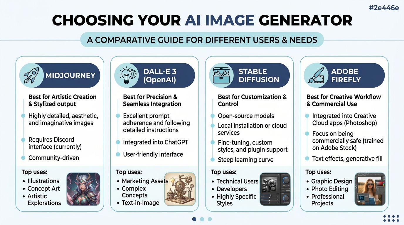
Midjourney is the market leader, holding 26.8% of the global generative AI image tool market, and it leads the next competitor by more than 2% according to AI art market statistics compiled here. That matters because a lot of prompt examples online are really Midjourney examples, even when the article doesn't say so clearly.
Its strength is control for users willing to learn its syntax. Instead of typing casually and hoping for the best, you often use /imagine and add parameters like aspect ratio or model version. That's powerful, but it also creates friction for beginners. Small teams often hit that friction fast when they need repeatable outputs but don't want to train everyone on commands.
When chat-style generators make more sense
DALL-E-style interfaces and similar web-based tools are easier for casual users because they feel more like chatting than configuring. That's useful for:
- Parents making party art, story visuals, or printable activities
- Students drafting presentation images quickly
- Small business staff who need a usable image without learning command syntax
The trade-off is control. Simpler interfaces often hide settings that advanced users want.
The privacy and workflow angle
For families and small businesses, privacy isn't a side issue. It's part of tool selection. If you're working with family photos, school-related visuals, internal company concepts, or early campaign drafts, you should care where prompts and uploads go, who can view them, and whether the workflow is suitable for shared team use.
That's where privacy-first platforms stand out. A lot of mainstream advice focuses on image quality alone and skips practical concerns like family-safe use, team access, and how comfortable you are uploading sensitive material. If those factors matter more than public community galleries or experimental controls, compare plan options and workspace fit before choosing. For that angle, 1chat pricing for teams, families, and students is the relevant place to evaluate suitability.
The best generator is the one your household or team will actually use correctly, consistently, and safely.
A simple selection filter
Use this quick filter:
- Choose Midjourney if you want more parameter control and you're comfortable with a steeper learning curve.
- Choose a chat-style generator if speed and ease matter more than fine-grained syntax.
- Choose a privacy-first workflow if you're handling family-related content, internal business material, or student work that shouldn't be casually exposed.
- Choose local or more customizable tools only if you're prepared for more setup and more responsibility.
Preparing Inputs and References
Weak inputs waste time. Most bad AI image results start before the prompt. They start with a fuzzy brief, a messy reference image, or an unclear goal. If you want cleaner outputs, prepare your inputs the same way you'd prepare instructions for a human designer.
Start with the job, not the style
Before you gather anything, decide what the image must do.
A bakery social post needs a different image than a classroom handout. A family birthday invitation needs a different tone than a real estate banner. When people skip this step, they stuff every idea into one prompt and get clutter back.
Use a short brief with three parts:
- Purpose
Example: Instagram promo, classroom slide, birthday card, website hero image - Main subject
Example: cupcake display, Roman marketplace illustration, cartoon family picnic - Visual direction
Example: watercolor, clean flat illustration, soft photo style, festive and bright
Build a reference pack
Reference images help when words alone are too loose. They're especially useful for color palette, composition, product shape, clothing style, room layout, and illustration mood.
A practical reference pack usually includes:
- One subject reference
The object, person, space, or product you want the image to revolve around - One style reference
An example that shows the rendering style you want - One composition reference
A sample that shows framing, camera angle, or layout
Don't throw in ten references unless the tool is designed for that kind of complexity. Better results often come from fewer, cleaner examples.
If the reference image contains private people, kids, or identifiable home details, stop and ask whether you should upload it at all. Convenience isn't the same as a good decision.
Clean the files before upload
Reference images work better when they're easy for the model to interpret.
Do this first:
- Crop distractions out
If the image is meant to show a mug, remove the cluttered kitchen background. - Use clear filenames
“blue-ceramic-mug-front.jpg” is more useful in your own workflow than “IMG_4832.jpg”. - Pick sharp, well-lit examples
The model can't reliably infer details that aren't visible. - Avoid collages unless needed
If you upload a crowded mood board, the generator may blend features you didn't intend to combine.
Keep legal use simple
For business and school work, don't grab random images from social media as style or product references. Use assets you own, public domain material, or royalty-free libraries with clear terms. For family projects, it's easy to get casual about this because the work feels personal. But if the output gets posted publicly or used on print items, that shortcut can become a problem.
A safer approach is:
- use your own photos
- use properly licensed stock
- use public domain references
- create rough sketches yourself if you just need layout guidance
Prepare text references too
Not every input has to be an image. A short written reference often improves the result more than another upload.
Try this format:
| Input type | What to include | Example |
| Goal note | What the image is for | “Flyer header for a school science fair” |
| Subject note | Main object or scene | “Kids viewing a volcano project indoors” |
| Style note | Desired visual treatment | “Bright educational illustration, readable, not photorealistic” |
For small businesses, I've found this especially effective when owners know their brand mood but don't know design vocabulary. “Warm neighborhood café, handmade feel, not luxury, not sterile” is more useful than forcing technical art terms.
Crafting Effective Prompts and Modifiers
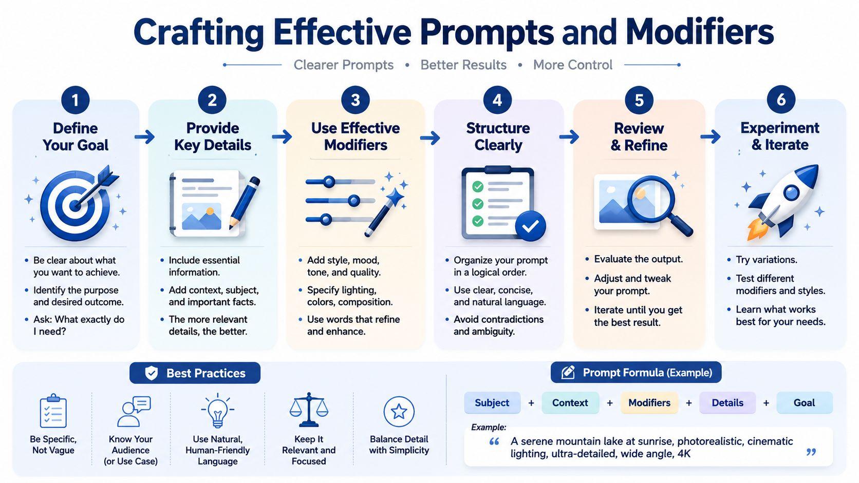
Many users don't need longer prompts. They need better-ordered prompts. That's one of the biggest practical lessons in learning how to use AI image generator tools well.
Put the important idea first
Prompt weighting is real. According to Getty Images guidance on AI generation, 68% of failed multi-subject prompts come from users not understanding that models give much less weight to words after the first 10 to 15 tokens. In practice, that means your opening words do most of the work.
If you write:
Beautiful detailed digital artwork of a cat walking down a city street with neon signs and, in the distance, a glowing doorway in a desert scene under stars
the model often locks onto cat plus city street and omits the doorway and desert.
A stronger version is:
“Cat walking down a city street, glowing doorway visible in background, surreal desert horizon beyond the street, neon signs, night scene, cinematic digital art”
The main subjects and scene logic appear earlier.
Use prompt decomposition
When a request is complex, break it into parts before you write the final prompt.
A simple decomposition model:
- Core subject
What must be present no matter what - Environment
Where the subject exists - Secondary elements
Objects or people that support the scene - Style and lighting
How it should look - Constraints
What must not happen
For example, a family invitation image might be built like this:
- Core subject: cartoon family of four at a picnic
- Environment: spring park with blankets and balloons
- Secondary elements: birthday cake, dog, trees
- Style and lighting: soft watercolor, cheerful daylight
- Constraints: no text, no realistic faces, child-safe tone
That structure is cleaner than dumping every detail into one sentence.
Modify one variable at a time
When the first set is close but wrong, don't rewrite the whole prompt. Change one element and compare.
Useful modifiers include:
- Lighting
morning light, golden hour, overcast, studio light - Mood
playful, calm, dramatic, cozy, editorial - Medium
watercolor, flat vector, pencil sketch, cinematic photo - Framing
close-up, overhead, wide shot, centered composition - Surface detail
textured paper, glossy product finish, matte illustration
A prompt fails less often when each phrase has a job. Cut decorative words that don't change the picture.
Better prompt patterns for real users
For a small business
Instead of
“Make a cool image for a bakery ad”
Use
“Front-facing pastry display in a small neighborhood bakery, warm morning light, handmade feel, seasonal spring colors, clean space for promo text at top, realistic food styling”
For a family project
Instead of
“Birthday invite with kids and fun things”
Use
“Whimsical illustrated birthday picnic, two children playing near balloons and cake, bright park setting, soft pastel palette, friendly storybook style, no text”
For a student presentation
Instead of
“Ancient Rome school image”
Use
“Ancient Roman marketplace, students-friendly educational illustration, merchants, pottery, fabric stalls, daylight, clear composition, historically inspired visual tone”
If you want more examples of prompt thinking and AI workflow habits, 1chat blog articles on practical AI use are a useful companion read.
Configuring Advanced Settings
Most users leave quality on the table because they ignore settings. Prompt text matters, but settings shape how the image is framed, how sharp it looks, and whether you can reproduce a result later.
The settings that matter most
Aspect ratio controls composition. A square image suits many social posts. A wide ratio works better for website banners, YouTube thumbnails, and presentation headers. If a family wants a printable invitation, portrait layouts often make more sense than square ones.
Resolution affects clarity and editing flexibility. Draft low if you're still exploring. Increase output size once the composition is right. Don't waste high-resolution generations on prompts you haven't stabilized.
Seed is useful when the tool supports it. A seed helps you recreate a similar composition or visual mood after making a small prompt change. For business work, that's helpful when a client likes the image structure but wants different colors or a different product.
Iteration and variation controls help you refine without starting over. If the base image is mostly right, use variations. If the structure is wrong, start a fresh generation.
Advanced Settings Overview
| Setting | Effect | Recommended Use |
| Aspect ratio | Changes framing and layout | Use square for social posts, portrait for invites and posters, wide for banners and headers |
| Resolution | Changes image clarity and editing room | Keep drafts lower, increase for print, cropping, or detailed post-processing |
| Seed | Helps reproduce similar results | Use when you want to keep composition stable while adjusting one element |
| Variation or iteration | Refines an existing direction | Use when one output is close and you want alternate versions of that same idea |
What works and what doesn't
What works is matching settings to the final destination. A school slide image doesn't need the same setup as a printable menu poster. A web banner needs negative space for text, so wide framing matters more than decorative detail.
What doesn't work is treating settings as magic fixes. If the prompt is confused, changing every slider won't save it. Fix the instruction first, then fine-tune the technical controls.
For small teams, I recommend saving a few repeatable presets by job type. One for product promos. One for blog headers. One for printable family graphics. One for classroom visuals. That cuts rework and keeps style more consistent across repeated tasks.
Tips for Post Processing and Troubleshooting
Good AI images usually need a finishing pass. Even strong generations can have weak text areas, odd edges, or small artifacts that make the whole image feel cheap.
Use a light edit workflow
You don't need a full design suite for every image, but basic editing helps a lot. Photoshop, GIMP, Canva, and online upscalers can all handle simple cleanup.
Focus on these fixes first:
- Crop for composition
Remove dead space and tighten the focal point. - Correct color and contrast
Slight adjustments often make AI images feel less muddy. - Sharpen selectively
Add detail to the focal subject, not the whole frame. - Replace text manually
If the image includes signage, labels, or invitation wording, rebuild that text in a design tool.
Use the rule of four before judging a prompt
AI image generation usually produces multiple variations per prompt, and DigitalOcean's explanation of image generation workflows notes that users shouldn't judge a prompt from a single result. The practical rule is simple. Review all four outputs before changing the prompt.
That avoids a common mistake. People see one bad image, assume the prompt failed, and rewrite too early.
Don't diagnose a prompt from one image. Diagnose it from the full batch.
Fix common problems by isolating the cause
If the image looks wrong, identify one failure at a time.
| Problem | Likely cause | Best fix |
| Blurry or broken text | Model limitation | Remove text from prompt and add it later in an editor |
| Crowded composition | Too many ideas competing | Reduce subjects and simplify scene instructions |
| Background missing | Important detail placed too late | Move the background element earlier in the prompt |
| Face or hand artifacts | Fine-detail generation issue | Regenerate with tighter framing or switch style |
| Strange colors or skin tone shifts | Vague lighting or style cues | Specify lighting more clearly and reduce style overload |
For families and students, the simplest rule is this. If the image is emotionally right but technically imperfect, edit it. If the image misunderstands the scene, regenerate it.
Ethical Practices and Real-World Examples
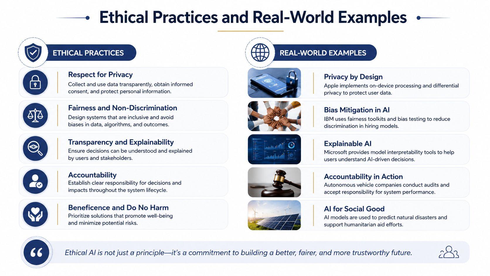
AI image generation gets risky when users treat safety as an afterthought. That's especially true for family use, school use, and business use involving real people.
Use safety-first prompts before upload
A point that many tutorials miss is risk-based routing. This discussion of unrestricted image tools and safety gaps highlights that mainstream guides often skip practical frameworks for handling sensitive subjects like real-person likeness or age-ambiguous minors. The safest move is to stop the problem before generation.
That means asking these questions first:
- Is this based on a real person?
- Do I have permission to use that likeness?
- Could the age be ambiguous?
- Is the request private, sexualized, deceptive, or non-consensual?
- Should this be generated at all?
If the answer raises concern, don't “test and see what happens.” End the request there.
If a prompt involves a real person, a child, or private context, your first decision is whether to generate it at all. Tool choice comes second.
Ethical examples that hold up in real use
A startup can use AI images responsibly by generating concept art for social posts, then having a designer clean up the final campaign assets. A history teacher can create scene illustrations for a lesson without fabricating real historical photographs. A family can make custom birthday invitations using fictional cartoon versions of family members instead of uploading identifiable child photos.
Small businesses can also use AI to prototype merchandise ideas before ordering samples. If that's your use case, an AI merch design platform can help teams move from concept to product mockups without treating public likenesses carelessly.
The privacy-first takeaway
For households, schools, and small teams, privacy belongs in the workflow from the start. You should know where prompts go, who can access uploads, and whether the platform fits family-safe and business-safe use.
That's why privacy-first tools deserve a place in the final decision, not as an afterthought. If you want one place to handle AI chats, documents, and image generation with a family-friendly and team-oriented setup, 1chat is designed around that need. You can explore it directly at 1chat.
If you want to get better at how to use AI image generator tools, don't chase perfect prompts. Build a repeatable process. Choose the right platform for the job. Prepare clean references. Put the key subject first. Change one variable at a time. Edit the final output like a human who cares about the result.
That workflow is what separates random AI art from useful images people can publish, print, share, and trust.