At 10 p.m., Maria, who runs a two-person bakery, is staring at a blank Canva canvas. The weekend special is ready, the ovens are cooling, and the post that should bring customers through the door still doesn't exist. A parent preparing a school newsletter, or a student club announcing its next meeting, may recognize the same feeling: the idea is clear, but turning it into something people can quickly understand feels harder than it should.
That task is visual content creation. It means turning a product, idea, announcement, lesson, or everyday moment into a picture, graphic, video, or social post with a clear purpose. You don't need to be a professional designer. You need a message, a particular audience, and a small process you can repeat without exhausting yourself.
Visual production has grown into a major digital market. The global digital content creation market was valued at USD 32.28 billion in 2024 and is projected to reach USD 69.80 billion by 2030, with a projected 13.9% compound annual growth rate from 2025 to 2030, according to Grand View Research's digital content creation market analysis. That growth includes images, video, graphics, and interactive media used in marketing, education, and everyday business communication.
The important change isn't the size of the market by itself. It's that visual creation now belongs to small shops, families, school volunteers, and student groups too. This guide treats it as a daily-life skill, then shows where AI image generation can save time while keeping people in control of privacy, accuracy, and final decisions.
What Visual Content Creation Really Means in 2026
Maria runs a small bakery. She does not need an agency campaign. She needs one useful post telling local customers what she baked, when it is available, and how to order. A phone photo may provide the starting point, while a simple process helps her choose a clean background, add the product name and pickup time, and keep the words readable on a small screen.
That process turns an ordinary snapshot into purposeful visual content. A snapshot records an event or object. A purposeful visual guides attention, understanding, memory, or action. The same idea helps a parent prepare a school newsletter header or a student club announce a meeting. The core questions are: Who is the audience, what is the single takeaway, and on what device will they see it?
The wider market reflects this change. One estimate places the visual content segment at about USD 5.2 billion, with a projection of USD 19.17 billion by 2032 and a 15.6% CAGR, as reported in the Grand View Research market overview. The figures describe a broad commercial field, yet the practical lesson is smaller and more useful: visual work has become part of regular communication, not merely a decorative extra.
Purpose comes before polish
A useful visual can stay simple. A bakery's weekend card might use one product photo, two colors, and a short sentence. A school newsletter might use a friendly illustration with a clear date. A club post might show a bold title, room number, and contact name.
Before opening a design tool, write one sentence:
Practical rule: Decide what the viewer should know or do before deciding what the visual should look like.
This order prevents a common beginner mistake: choosing colors, templates, or effects before choosing the message. It also makes review easier. If the post does not support that sentence, the next edit has a clear purpose.
A skill for ordinary routines
Visual content creation involves planning, selecting references, drafting, editing, checking, and publishing. The work can happen with a phone, a free template, a shared folder, and a few focused minutes. AI image generation can also help create a starting illustration or background, especially when a family, student group, or small shop lacks a suitable photo. The creator still checks accuracy, avoids exposing private details, and makes the final choice.
For a family, the result might be an invitation or vacation update. For a student, it could be a presentation slide or event graphic. For a small business, it might be a product image, short video, or announcement. The skill is not about making every post look expensive. It is about helping real people communicate clearly and consistently with the tools and time they have.
The Four Core Types of Visual Content
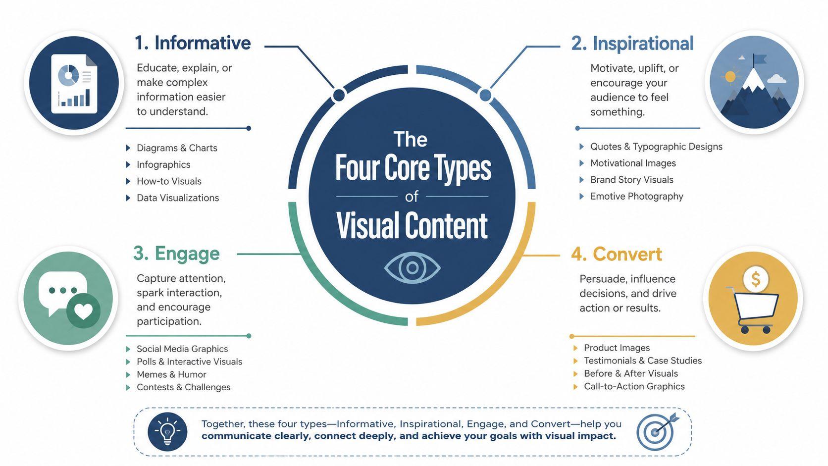
Beginners often ask which format they should use. Start with the job, not the software. A still image, infographic, video, or social post can all work, but each carries information differently.
Images are like handwritten thank-you notes. They make one clear impression quickly. A bakery can photograph a tray of cinnamon rolls, a family can share a birthday table, and a parent can include a candid image in a newsletter. The picture works best when the viewer should recognize a person, place, product, or moment immediately.
Infographics behave more like labeled maps. They organize steps, comparisons, facts, or instructions so readers can see the relationship between pieces of information. A school newsletter might show the morning drop-off process, while a bakery could explain how to store a cake. The layout does much of the teaching.
Videos are short stories told through motion, sound, captions, and sometimes a person's face. A student club can show what happens at a meeting. A baker can demonstrate how a cake is decorated. A parent can record a short welcome from a teacher, provided the school has approved the recording and sharing process.
Social posts are the friendly combo plate. They combine an image, text, color, and a platform-ready layout designed to stop a scroll and deliver one announcement. A club might post its meeting title, date, location, and registration instruction on one card.
Match the format to the task
Use this quick decision guide:
- Choose an image when recognition matters most, such as a product, person, or event.
- Choose an infographic when the audience needs to compare, follow, or remember several connected points.
- Choose a video when movement, voice, demonstration, or emotion adds useful context.
- Choose a social post when you need a compact announcement that combines words and visual identity.
A format can also support another format. A video may need a thumbnail. An infographic may become a social card. A product image can appear inside an email, newsletter, or event page. Good visual content creation doesn't force every idea into one shape. It gives the idea a shape that suits the audience.
Keep one message visible
A beginner's design often tries to say everything at once. The result may include a long paragraph, several photos, multiple decorative elements, and competing calls to action. Ask what someone should understand after a brief glance. Then remove anything that doesn't help that understanding.
A school announcement needs its date and action. A bakery post needs its offer and ordering detail. A club graphic needs its event information. Clarity is more valuable than decoration.
Why Video Now Leads the Visual Conversation
Video isn't always the easiest format, but it often combines the most communication tools in one place. Movement can demonstrate a process, a voice can explain a detail, captions can support silent viewing, and a face can make an announcement feel personal.
The adoption data is strong. A Marketful summary of visual content marketing statistics reports that 91% of businesses use video as a marketing tool, 85% of people say a video has convinced them to buy a product or service, and 92.3% of internet users worldwide engaged with online video in Q3 2024. The same source reports that the average internet user watches about 19 hours of online video per week, or roughly 100 minutes per day.
These figures help explain why a bakery may film the final decoration of a cake, why a school may share a captioned event reminder, and why a student club may post a short introduction from its organizers. Video compresses demonstration, context, and feeling into a format phones are built to play.
Comparing the four core visual formats
| Format | Effort Level | Best Use Case | Shareability |
| Image | Low | Product recognition, family updates, simple announcements | Easy to save and share |
| Infographic | Medium | Steps, comparisons, instructions, connected information | Useful when the information is clear |
| Video | Medium to high | Demonstrations, introductions, stories, movement | Strong when the opening is clear and captions work |
| Social post | Low to medium | Fast announcements and platform-ready updates | Convenient for feeds and group sharing |
Effort depends on the subject and the creator's experience. A fifteen-second phone clip may take less time than a carefully arranged infographic, while editing, captions, and approvals can make video more demanding than it first appears.
Use video as a focus, not a rule
Video wins when the viewer benefits from seeing something happen. It isn't the right answer for every message. An infographic is better for dense instructions, an image is better for instant product recognition, and a social card is better for a quick date or location announcement.
Start with a short clip rather than a production. Place the most important information near the beginning, record in a quiet location, and add captions before publishing. Keep the other formats available as supporting tools. A strong visual content creation routine uses video where motion helps, not where motion merely adds work.
A Beginner-Friendly Workflow That Actually Works
A reliable workflow turns creative work into a sequence of small decisions. Follow the same order for a bakery announcement, a school newsletter header, or a student club post.
1. Write a one-sentence brief
Name the audience, message, and destination. For example: “Parents need to know that the spring concert starts at 6 p.m., and this graphic will appear in the school newsletter.” A bakery version might say: “Local customers should know that weekend fruit tarts are available for Saturday pickup, and this image will appear on Instagram.”
The sentence keeps the draft from drifting. It also tells you what information can't be hidden in decorative text.
2. Gather rough references
Collect a few useful examples from competitor posts, stock libraries, old newsletters, or your own sketches. You're not copying them. You're noticing choices such as background color, image angle, title placement, and the amount of text that feels comfortable.
Save references in a folder with a simple name, such as “Spring Concert” or “Weekend Tarts.” A shared workspace such as 1chat's blog can also help a small team keep related ideas and AI-assisted drafts in one place.
3. Draft quickly
Treat the first version as a sketch. Add the main image, the title, and the essential detail before adjusting shadows, borders, or decorative elements. If you're working in Canva, begin with a plain template. If you're using a phone, take several versions rather than waiting for one perfect shot.
4. Review against the brief
Check whether the message is accurate and easy to read. Look at the design on a phone, confirm that the colors fit your existing materials, and write useful alt text. If the critical information appears only inside an image, prepare a text version too.
5. Export and publish
Choose the correct format and size for the platform, then schedule or publish the finished piece. Keep the editable file and final export in clearly named folders. The loop repeats for each post, not once per quarter. Repetition turns the process into muscle memory.
A useful habit: Finish the message before you decorate the message.
Where AI Image Tools Fit Into Your Workflow
AI image generation works best as a junior assistant inside the workflow, not as the person responsible for the final result. It can help transform a rough idea into a brief, suggest visual directions, create a first draft, or produce variations for different uses.
For example, a prompt can specify a warm bakery counter, a close view of a fruit tart, natural morning light, an uncluttered background, space for a short headline, and no visible customer information. That prompt gives the tool useful boundaries. The same structure can help a student club request an illustrated event card or help a parent explore a newsletter theme.
AI image tools across the workflow
| Workflow Step | How AI Helps | Human Review Needed |
| Brief | Turns a rough idea into audience, message, style, and placement notes | Confirm the purpose and factual details |
| Gather | Suggests references, moods, compositions, and color directions | Check that the references suit the audience and brand |
| Sketch | Produces early concepts, backgrounds, mockups, or social-card ideas | Reject unusable layouts and misleading imagery |
| Review | Helps identify missing text, awkward composition, or inconsistent tone | Verify claims, likeness rights, logos, accessibility, and privacy |
| Publish | Assists with captions, variations, and repurposing | Confirm the final format, approvals, and destination |
Text-to-image tools remain unreliable with small text, exact logos, hands, and specific product details. An AI-generated bakery sign may contain invented lettering. A school illustration may accidentally resemble a real child. A club graphic may use a symbol that suggests an affiliation the group doesn't have.
Human review also matters because visual quality has several dimensions. Recent evaluation research separates distribution alignment, perceptual realism, and statistical fidelity, using measures such as Inception Score, Fréchet Inception Distance, and CLIP-based similarity to examine different failure modes, as described in this survey of text-to-image evaluation methods. A tool can produce a visually attractive image that still misses the prompt or fails practical judgment.
For professional-looking portraits, readers may compare workflows in this guide to the best AI tools for corporate headshots. That kind of tool can be useful for a profile image, but you should still confirm consent, likeness accuracy, and whether the result represents the person accurately.
Use AI to widen the first-draft options. Keep the final edit with a person who knows the audience, the facts, and the people shown.
Accessibility and Privacy You Should Plan From Day One
Accessibility and privacy aren't advanced features for large organizations. They're ordinary planning questions for a family, classroom, bakery, or club. If you wait until after publishing, you may discover that a child appears without permission, an address is visible, or the most important announcement can't be read by someone using a screen reader.
Start with the brief. Identify who needs the information and how they may receive it. Then build the visual so the message doesn't depend on one sense or one viewing condition.
Make the message usable
Use alt text that describes the image in context, not just its objects. “Blueberry tart on a bakery counter, available for Saturday pickup” gives more useful information than “food photo.” Keep strong contrast between text and background, avoid placing critical information only inside an image, and add captions to videos.
A simple accessibility check includes:
- Readable text: View the design on a small phone before publishing.
- Useful alt text: Explain what the image contributes to the surrounding message.
- Captions: Include spoken information in videos, especially for silent viewing.
- Clear hierarchy: Make the title, date, location, and action easy to distinguish.
- Text alternatives: Repeat essential details in the post caption or newsletter text.
Privacy requires the same early attention. Get consent before sharing photos of children, customers, classmates, or guests. Check school photo policies. Blur license plates, house numbers, street signs, and visible addresses. Review AI tool policies before uploading personal images, because uploaded material may be stored or used for training depending on the service.
Use a one-minute privacy test
Ask: If a stranger saw this post, would my family, customer, or student be comfortable with what it reveals? If the answer is uncertain, crop the image, remove the identifying detail, request permission, or choose a different visual.
Families and teams can also review the platform's data practices before sharing files. The 1chat privacy policy is one example of the kind of information users should look for when evaluating an AI workspace. The specific service matters less than forming the habit of checking before uploading.
Your 30-Day Visual Content Starter Plan
A month is long enough to build a routine without turning the project into a second job. Keep the target small: one weekly improvement and a brief daily habit.
Week one, create a dependable base
Set up folders for raw photos, working files, final exports, and reusable templates. Choose two brand colors, one readable font, and a temporary logo placeholder if you don't have a finished logo. Then collect five raw photos from your bakery, family archive, classroom, or club activities.
Your daily habit is simple: save one useful visual or write one post idea. Don't judge every idea while collecting it. You're building a small library that will make future drafts easier.
Week two, explain one idea
Create one infographic using a free template. Choose a narrow topic, such as the steps for ordering a cake, the items students should bring to an event, or the process for joining a club. Write alt text before publishing, while you still remember what the graphic is meant to communicate.
Spend a few minutes each day checking whether the information remains readable at phone size. Remove anything that makes the central instruction harder to find.
Week three, record a short video
Make a 30-second phone video showing one useful action, such as decorating a pastry, arranging a newsletter table, or preparing a club meeting space. Add captions before posting. If the recording includes other people, confirm permission first.
Daily practice can be as small as reviewing one clip, trimming an unnecessary pause, or rewriting the opening sentence so viewers understand the subject quickly.
Week four, test AI carefully
Use an AI image generator for one social post concept. Give it the subject, visual direction, composition, aspect ratio, and exclusions. Review the result for invented text, inaccurate objects, unwanted likenesses, visible private details, and brand mismatch.
A workspace that includes AI image generation, such as 1chat, can fit this experiment alongside writing and document work. Review the 1chat pricing information before choosing whether its plan suits your needs.
After the month, batch-create one week's visuals in a single sitting. Keep the routine manageable, revisit the brand folder monthly, and delete drafts that contain children's faces or customer addresses once the approved version is published. Privacy-first visual content creation isn't about avoiding useful tools. It's about making deliberate choices before a private moment becomes permanent.
Choose one upcoming announcement today, write its one-sentence brief, and make the simplest visual that communicates it clearly. Save the editable file, check accessibility and privacy, then publish it. Your first post doesn't need agency polish. It needs a real message, a thoughtful review, and a process you can confidently repeat.