When it comes to writing a business report, the biggest mistake I see people make is diving straight into the writing. They start with the introduction, try to organize their data on the fly, and end up with a document that’s confusing and misses the mark. The secret to avoiding this mess is simple: build a blueprint first.
Building Your Blueprint for a Powerful Business Report
Staring at that blinking cursor on a blank page is universally dreaded. But you don't have to start there. A solid blueprint gives you a clear path forward, turning a mountain of a task into a series of manageable steps. This isn't just about making a generic outline; it's about being strategic from the very first minute.
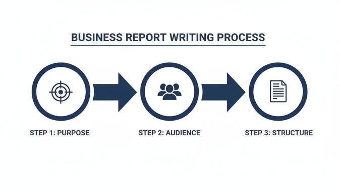
Before I ever write a single sentence of the report itself, I get crystal clear on two things:
- What's the real goal here? Am I just updating my boss on quarterly numbers? Am I trying to convince a skeptical client to sign on the dotted line? Or am I dissecting a problem to figure out the best solution? Your answer is your north star—it dictates the tone, the data you include, and the final call to action.
- Who am I writing this for? This is non-negotiable. An engineer will want the raw data and technical specs, but the CEO just wants the bottom-line impact. If you don't tailor your language and focus to your reader's priorities, you've already lost them.
The Foundation of Every Report
Let's face it, reports are a constant in the business world. In fact, some studies show that over 75% of companies are churning out at least five business reports every single month, with each one taking more than three hours to put together. You can learn more about these fascinating reporting trends and their impact on productivity. With that kind of time investment, you can't afford to be inefficient. A solid, repeatable structure is your best friend.
To get you started, here’s a breakdown of the core sections you'll find in almost any powerful business report. I always use this as my foundational checklist.
Anatomy of a Powerful Business Report
Think of this table as the universal anatomy of a report. Each part has a distinct job to do.
| Section | Purpose and Key Content |
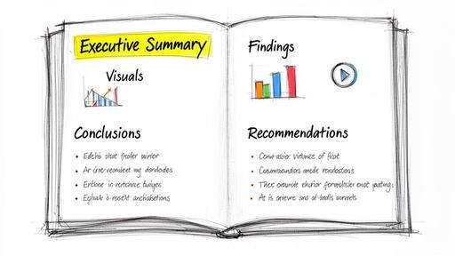
| Executive Summary | Your report in a nutshell. This is a high-level overview of the purpose, key findings, and ultimate recommendations. A busy executive should be able to read this and know exactly what they need to know. |
| Introduction | This is where you set the scene. You’ll define the report's purpose, what it covers (and what it doesn't), and the core problem or question you're addressing. It answers, "Why does this report exist?" |
| Findings / Analysis | The heart of the report. Here, you present your data, facts, and evidence in a logical flow. Don't just dump information; use charts and graphs to make your key points pop. |
| Conclusion | This section answers the "So what?" question. You’ll interpret the findings from the previous section and explain what it all means in the bigger picture. |
| Recommendations | Now it's time to answer, "Now what?" Propose clear, specific, and actionable steps that are directly supported by your conclusion and analysis. |
| Appendices | A home for everything that’s important but too detailed for the main body. This can include things like raw data sets, full interview transcripts, or technical documentation. |
Once you have this structure in mind, you're ready to start building out your specific outline.
If you're feeling stuck, modern tools can give you a major head start. For instance, you can use an AI assistant like 1chat to help brainstorm an initial outline. Just feed it your main objective and audience, and it can generate a tailored structure based on these classic sections.
Using a tool like this can quickly get your ideas organized, making that initial drafting phase feel much less intimidating. By mastering this blueprint approach, writing a report goes from being a chore to a clear, strategic process.
Planning Your Report Before You Write a Single Word
I've seen it a hundred times: someone gets an assignment to write a business report and immediately opens a blank document. That’s probably the biggest mistake you can make. The most effective reports—the ones that actually get read and lead to action—are won or lost before you ever type a single word.
So, before you do anything else, you need to answer one question: What is this report for?
Seriously. Is it just to inform people, like a weekly performance update? Or are you trying to persuade your boss to fund a new project? Your answer changes everything, from the data you gather to the tone you take.
Getting this right from the start is your North Star.
- Informational Reports: These are all about presenting the facts, plain and simple. Think status updates, meeting minutes, or financial summaries. The goal here is clarity and objectivity—just a snapshot of what’s happening.
- Analytical Reports: Here, you're not just presenting data; you're interpreting it. A market analysis, for instance, doesn’t just show sales figures. It digs into why the numbers are what they are. You're connecting the dots for your reader.
- Persuasive Reports: This is where you’re building a case. Proposals, justification reports, and feasibility studies all fall into this category. Your goal is to convince the reader to take a specific action.
This flow—from purpose and audience to the final structure—is the foundation of any good report.
As you can see, purpose and audience aren't just boxes to check. They're the pillars holding the entire thing up. Get them wrong, and the whole report comes crashing down.
Know Who You're Writing For
Once you've nailed down your purpose, you have to think about who's going to read this. It’s rarely just one person. Your report might land on the desks of your direct manager, a department head, and a C-suite executive, all in the same day. Each one has a different perspective and needs something different from you.
A report written for an engineer will fail if given to a CEO, and vice versa. The engineer wants technical details and methodology, while the CEO wants the bottom-line impact and a clear recommendation. Your ability to speak to both is a superpower.
To make sure your message hits home, take a minute to map out your audience. A quick mental checklist is all you need:
- What’s their role and how much authority do they have?
- How much do they already know about this subject?
- What are their biggest concerns or goals related to this topic?
- What’s the one piece of information they absolutely need to make a decision?
Answering these helps you cut through the noise, use the right language, and frame your conclusions in a way that matters to them.
Gather Your Facts and Create a Blueprint
Okay, you've got your purpose and you know your audience. Now it's time to start gathering the information you need. This can feel like trying to drink from a firehose. The average company uses over 10 different tools to monitor performance and collect data, so there's never a shortage of it.
Your job isn't just to collect data—it's to organize it. The best defense against writer's block is a solid outline. I'm not talking about a simple list of headings. I mean a real blueprint for your report.
For every section of your outline, jot down the key point you're trying to make and the specific piece of evidence you'll use to back it up. For example, under your "Findings" section, you might have a point like: "Q3 sales dropped by 15% (see Chart 1)" and another that says: "Competitor X launched a major campaign in July (source: market report)."
This approach turns a mountain of data into a clear, logical story. It gives you a roadmap to follow from your first sentence to your final recommendation. If you want to get better at this crucial step, take a look at our guide on how to improve research skills.
Building Your Report, Section by Section
You’ve done the legwork, gathered the data, and your outline is ready to go. Now it’s time to start writing. This is where you bring your research to life, transforming raw information into a clear story that drives action.
Each section of a business report has a distinct job to do. Once you understand the role of each part, you can write a report that doesn't just get filed away, but actually gets read and acted upon.
Let's walk through the core components, focusing on how to make each one clear, purposeful, and effective.
The Executive Summary: Your Report's First Impression
Here’s a pro tip: even though it’s the very first thing people read, you should always write the executive summary last. Think of it as the movie trailer for your report. It has to hook your audience, highlight the most critical information, and convince them the rest is worth their time. A busy executive should be able to read this section alone and grasp the entire picture.
A great summary is brief and stands on its own. Make sure you hit these four points:
- The Purpose: Start with a single sentence explaining why this report exists.
- Key Findings: What are the 2-3 most important discoveries you made?
- The Conclusion: What's the bottom line? What does all the data point to?
- Your Recommendations: State the main action you're proposing.
This is arguably the most valuable real estate in your entire document, so polish every word. For a more detailed look, our guide on how to write executive summaries is a great resource.
The Findings: Present the Facts Objectively
This section is the heart of your report—it's where you lay out the evidence. The key here is objectivity. You aren't interpreting anything yet; you are simply presenting the facts you uncovered. Let the data do the talking.
Your biggest enemy here is the "wall of text." No one wants to read long, dense paragraphs. Structure your findings so they are easy to scan and understand.
Many organizations are still creating reports the old-fashioned way. Research shows 64.32% of businesses rely on traditional spreadsheets and 56.02% use Word or Google Docs. This gives you a massive opportunity to stand out. By structuring your findings with key performance indicators first and using strong visuals, you can make your report far more impactful. You can learn more from the full State of Business Reporting research.
Make your data digestible. Group related information under clear subheadings and use charts, graphs, and tables whenever you can.
Example: Reporting on a Website Traffic Drop
Instead of a long narrative, try organizing your findings like this:
Website Traffic Overview (Q3)
- Overall traffic dropped by 22% compared to Q2.
- Organic search traffic experienced the sharpest decline, falling 35%.
- Social media traffic remained stable, showing a small 2% increase.
Key Data Points
- The decline started on July 15th, which lines up with a major search engine algorithm update.
- Bounce rate on our top landing pages jumped from 45% to 68%.
This format is much easier to process. It allows your reader to see the problem at a glance. Just remember to give every chart or graph a clear title and a short caption explaining what it shows.
The Conclusion: Explain What It All Means
Now you get to answer the "So what?" question. Your conclusion is where you interpret the findings you just presented. If the findings are the "what," the conclusion is the "why it matters." You’re connecting the dots for your reader and explaining the significance of the data.
This is where your expertise really shines. You're no longer just a reporter of facts; you're an analyst guiding the reader to a specific understanding of the situation.
A strong conclusion should:
- Synthesize the main points from your findings.
- Explain the implications for the business. What risks or opportunities have you uncovered?
- State your final judgment or takeaway.
Using our website traffic example, a conclusion might be: "The 35% drop in organic traffic, happening right after the July algorithm update, shows that our current SEO strategy is no longer working. This puts our main source of new leads at serious risk." See how that sentence doesn't just repeat the facts? It interprets them to create urgency.
The Recommendations: Propose Clear, Actionable Steps
Finally, you answer the "Now what?" question. This is the most forward-looking part of your report and, frankly, the section most readers care about most. Good recommendations aren't vague ideas; they are concrete, actionable steps someone can take.
The best way to ensure your recommendations are solid is to make them SMART:
- Specific: What, exactly, needs to be done?
- Measurable: How will you track progress and define success?
- Actionable: Is this a realistic step that can be taken?
- Relevant: Does it directly solve the problem identified in your conclusion?
- Time-bound: What's the deadline or timeframe?
Let’s go back to our example. A weak recommendation is "Improve SEO." A strong set of recommendations looks like this:
Proposed Action Plan
- Conduct a full SEO audit of the website by October 31st to pinpoint specific technical issues and content gaps.
- Revise and republish our top 10 landing pages with updated, optimized content by November 30th.
- Launch a backlink-building campaign in Q4 with a goal of acquiring 15 new high-quality links to rebuild domain authority.
These recommendations are impossible to misunderstand. They outline clear tasks and create a framework for accountability, turning your report from a document into a plan.
The Final Polish: From Draft to Professional Document
You've done the heavy lifting—the research, the analysis, and the writing. It feels like you're done, right? Not quite. This last lap is where a good report becomes a great one.
I can't tell you how many times I've seen a brilliant business report fall flat simply because of sloppy presentation and careless errors. This final polish is what separates a document that gets skimmed from one that gets taken seriously.
Think of it as quality control. Even tiny mistakes can plant a seed of doubt, making a busy executive question the accuracy of your findings. A clean, professional finish shows you respect their time and stand by your work.
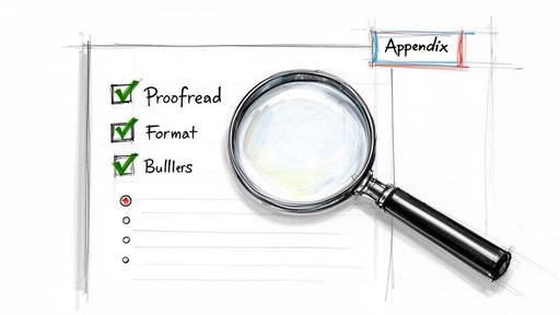
Your Pre-Flight Proofreading Checklist
Before you hit "send," your report needs a thorough review. My best advice? Step away from it for a few hours, or even a full day. You need to come back with fresh eyes to spot the mistakes you’ve become blind to.
Another trick I swear by is reading the report out loud. It forces you to slow down and immediately reveals awkward phrasing, typos, and sentences that just don't land right.
Here's the mental checklist I run through every single time:
- Grammar and Spelling: Start with a grammar checker, but don’t stop there. These tools are helpful, but they won't catch context-specific mistakes or oddly-worded sentences.
- Data Integrity: This is non-negotiable. Go back and double-check every number, date, and statistic against your original sources. A single misplaced decimal point can completely destroy your credibility.
- Consistent Language: Are you calling it the "Q3 Initiative" on one page and the "Third Quarter Project" on another? Pick one and stick with it for all key terms, names, and titles.
- Uniform Formatting: Scan your document to ensure all headings, fonts, and spacing are perfectly consistent. It’s a small detail that makes a huge difference in perceived professionalism.
A typo isn't just a typo; it's a signal. To a busy executive, it suggests a lack of attention to detail. If you were careless with your spelling, were you also careless with your data? Don't give them a reason to doubt your work.
Designing for Skim-Readers
Let's be honest: in a world of constant pings and notifications, almost no one reads a report word-for-word. They skim. Your report’s design is just as important as its content because it needs to be scannable.
A clean layout with plenty of white space is your best friend. It makes the page feel less intimidating and guides the reader’s eye to what matters. Use headings, subheadings, and bullet points to break up dense blocks of text and create a clear visual path through your findings.
As recent trends in business reporting show, the average report's complexity has jumped by 25% since 2022. That means a clean, scannable format isn't a "nice-to-have"—it's essential.
Your Secret Weapon: An AI Editing Partner
This is where modern tools can give you a serious edge. While you should never let an AI write your report from scratch, it can be an incredible partner for this final editing phase, helping you produce a polished draft in a fraction of the time.
Instead of just running a spell check, here are a few ways I use AI to get my reports ready for prime time:
- Spotting the “Invisible” Errors: AI is fantastic at catching those sneaky grammatical mistakes, punctuation goofs, and typos that our brains automatically correct when we read our own work.
- Smoothing Out Clunky Sentences: If a sentence feels long-winded or confusing, I'll ask an AI to suggest a few clearer, more concise alternatives. It's like having a professional editor on call.
- Running a Tone-of-Voice Check: You can paste a section of your report and ask an AI to analyze its tone. Is it objective? Persuasive? Consistently formal? This is a great way to ensure your entire document speaks with one voice.
Using a tool like 1chat for this final pass helps elevate your writing and catch those little things that signal true professionalism. For a deeper dive, you can learn more about how to leverage AI for report writing in our dedicated guide. This meticulous final step is what ensures your hard work gets the attention and respect it deserves.
Common Report Writing Mistakes to Avoid
We’ve all been there. You pour hours, maybe even days, into a report, only to have it land with a thud—no feedback, no action, nothing. It’s frustrating. But often, the problem isn't the data; it's the delivery.
Even seasoned pros can fall into a few common traps that completely dilute their message. Steering clear of these pitfalls is what separates a report that gets filed away from one that actually inspires change. It's a skill worth mastering, especially when you consider that firms with data-savvy employees report 20-30% better business outcomes. You can get a deeper look into this trend by exploring the state of modern business reporting.
Let's walk through the most frequent missteps I've seen and how you can avoid them.
A Vague or Missing Purpose
This is the big one. If you can’t state your report's goal in one simple sentence, you can't expect your audience to figure it out. Without a clear purpose, the entire document feels aimless, packed with information that might be interesting but doesn't lead anywhere.
I once saw an operations manager spend a week compiling a 10-page report on warehouse efficiency. It had every metric you could imagine—pick times, staffing schedules, inventory turnover. The problem? It never stated why. Was he asking for new software? Justifying overtime? No one knew, so the executives simply filed it away and nothing changed.
Before you even start writing, force yourself to finish this sentence: "The purpose of this report is to ______ so that my reader can ______." This little exercise brings immediate clarity to both your goal and the action you want to drive.
Burying the Lead
Decision-makers are busy. They don't have time to go on a scavenger hunt for your main point. A classic mistake is to build your report like a mystery novel, saving the big reveal for the final pages. In business, that’s a recipe for being ignored.
You have to work under the assumption that your reader may only scan the first page. That executive summary isn't just a warm-up; it's the most valuable space in your entire document.
If your key takeaway is hidden on page 12, it might as well not exist. Get straight to the point. Deliver the essential findings and recommendations upfront, then use the rest of the report to back them up with evidence.
Presenting Data Without Context
Dumping a series of charts and figures onto a page isn't analysis—it's just data decoration. Numbers without a story are just noise. Your job is to connect the dots for your reader, explaining what the data means and, more importantly, why it matters to them.
For every single chart, table, or statistic you include, apply the "So What?" test.
- The Data: "Sales decreased by 15% in Q3."
- The "So What?": "...which happened right after our main competitor launched their new product, putting our annual revenue target in serious jeopardy."
Answering "so what?" is how you transition from being a simple reporter of facts to a trusted analyst who provides real insight.
Overusing Jargon and Acronyms
When you're immersed in a project, it's easy to forget that your private language isn't universal. Filling your report with industry-specific jargon and internal acronyms is a surefire way to confuse and alienate anyone outside your immediate circle. It makes the document feel impenetrable.
A simple fix is to write for the person in the room with the least amount of context. If you absolutely have to use a technical term or acronym, just define it the first time you mention it. For example, "We will track three Key Performance Indicators (KPIs)..." That small effort makes your report more accessible and professional.
At the end of the day, avoiding these mistakes really comes down to having empathy for your reader. When you respect their time, anticipate their questions, and guide them logically to a conclusion, your reports stop being just documents. They become tools for real, measurable action.
Answering Your Top Business Report Writing Questions
Even with the best plan in place, questions always pop up when you're deep in the weeds of writing a report. Over the years, I've heard the same handful of questions from everyone from first-year students to seasoned executives.
Let’s clear up some of that confusion so you can get your report over the finish line with confidence.
How Long Should a Business Report Be?
Honestly, there’s no magic word count. The right length is dictated entirely by the report's purpose and who you're writing it for. A quick weekly sales update for your immediate team might be a single, data-rich page. A formal market analysis for the board of directors, on the other hand, could easily run 20 to 30 pages.
The best rule of thumb is to be as concise as possible. Before you write a single word, ask yourself: "What's the absolute minimum my audience needs to know to make a decision?" Let that question be your north star.
A short, sharp report that gets right to the point will always be more powerful than a long, rambling one that buries the key message. If you respect your reader's time, they'll respect your insights.
Focus on including only the information that directly supports your main objective. If a sentence or section feels like fluff, it probably is. Don't be afraid to cut it.
What Is the Difference Between a Conclusion and a Recommendation?
This one trips a lot of people up, but the distinction is actually quite simple—and getting it right is crucial for a strong report. Think of it as moving from interpretation to action.
A conclusion looks backward at your findings and explains what the data means. It’s your analysis of the facts, answering the "So what?" question.
- Conclusion Example: "The data shows a 20% decline in customer engagement from our key under-30 demographic over the last quarter."
A recommendation, on the other hand, looks forward and proposes a specific action based on that conclusion. This is where you answer the "Now what?" question and suggest a solution.
- Recommendation Example: "We recommend launching a targeted TikTok and Instagram Reels campaign in Q4 to re-engage this demographic with content tailored to their platform preferences."
Simply put, the conclusion identifies the problem or opportunity, and the recommendation suggests what to do about it.
How Can I Use AI Tools Responsibly for Report Writing?
AI can be an amazing co-pilot for writing reports, but it should never be the pilot. Your expertise and critical thinking are what give the report value. The trick is to treat AI as a smart assistant, not the author.
Lean on tools like 1chat for the more mechanical tasks that slow you down:
- Brainstorming an outline once you've defined your objective.
- Summarizing dense research articles to pull out the main themes.
- Polishing clunky sentences to improve the clarity and flow of your writing.
- Running a final proofread to catch any lingering grammar or spelling mistakes.
The single biggest mistake you can make is prompting an AI to "write a report on X" and using the output as your own. You must always verify any facts, figures, or data points an AI provides—they can and do make things up.
The best workflow? Write the core analysis and strategic insights yourself. Then, use AI to help you refine and format your work. This lets you focus your brainpower on the ideas, not the busywork.
What Is the Best Way to Present Data in a Report?
The short answer: visually. Our brains are wired to process images much faster than dense blocks of text. Using simple charts and graphs is one of the easiest ways to make your data jump off the page and stick in your reader's mind.
But don’t just throw a chart in and hope for the best. The goal is clarity, not just decoration.
Choose the Right Visual for the Job
- Bar Chart: Great for comparing distinct quantities, like sales figures across different regions.
- Line Chart: Perfect for showing a trend over time, like website traffic over the past year.
- Pie Chart: Use it to show parts of a whole, such as how a budget is allocated across departments.
No matter which visual you choose, always label it clearly with a descriptive title, labeled axes, and a legend if necessary.
Most importantly, never let a chart stand alone. Introduce it with a sentence that tells the reader what they're about to see, and follow it up with another that explains the key takeaway. You need to connect the dots for them and ensure your data tells the story you want it to tell.